monday service / SaaS ad concept breakdown
Ticket assignment.
Two ways to tell it.
How do you turn a workflow feature into a static ad? This monday service concept study uses automatic ticket assignment to connect a specific action with an IT support team’s everyday work.
Independent concept · Not commissioned by or affiliated with monday.com. AI-assisted visuals. Illustrative workflows, not product screenshots. No campaign results.
- Intended audience
- IT support leaders
- Message focus
- Automatic ticket assignment
- Work shown
- Two square concepts + landscape adaptation
THE IDEA IN BRIEF
One direction leads with the benefit: “Less sorting. More supporting.” The other asks about the routine: “Still assigning tickets by hand?” Both show requests reaching teammates. Neither presents assignment as a resolved support issue.
01 / THE CREATIVE DECISION
The brief: make one handoff visible
I focused this self-initiated brief on the moment a new ticket needs an owner. “Service automation” can cover many different actions; an incoming request reaching a teammate gives the ad one concrete event to explain.
The intended audience is an IT support leader familiar with distributing work. The creative does not attempt to explain the entire monday service platform. Its job is to make the assignment message understandable before inviting the viewer to explore the product.
02 / THE CREATIVE DECISION
Benefit-led copy versus a manual-task question
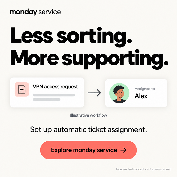
Direction 01: “Less sorting. More supporting.”
The light concept starts with the work the team wants to focus on. The supporting line names automatic ticket assignment, so the headline is connected to a specific mechanism. One illustrative VPN request and a teammate named Alex keep the handoff easy to follow.
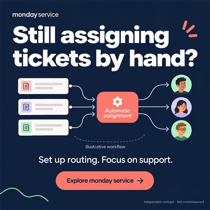
Direction 02: “Still assigning tickets by hand?”
The dark concept starts with a task the intended reader may recognise. Three incoming requests flow through an “Automatic assignment” block towards three teammates. During revision, that central block replaced an overloaded person: the focal point now explains the action rather than just illustrating frustration.
These are two creative directions, not an isolated headline test. The message, background, diagram and composition all change. A campaign comparison could assess the overall concepts, but it could not establish that the headline alone caused a difference.
03 / THE CREATIVE DECISION
What the visual sequence communicates
The light version uses one request and one owner; the dark version shows routing across a team. In both, the arrows end at people. There is no resolved-ticket state or invented time-saving figure. That boundary matters because assigning work and completing it are different events.
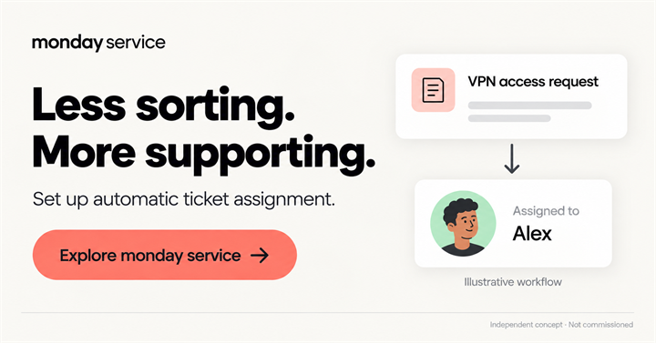
The landscape adaptation places the message and call to action beside the workflow. It is a separate composition, not a cropped square. Its smaller labels are harder to read at reduced sizes, so the light square is the first presentation here. Placement dimensions and a mobile legibility check would be part of production for an actual campaign.
04 / BEFORE A LIVE CAMPAIGN
What I would check before a campaign
First, ask viewers what changed in the diagram: did the ticket gain an owner, or do they think it was solved? If the second interpretation appears, the graphic needs clarification before a performance test.
Next, confirm the product wording, destination and audience with the advertiser. If comparing the two concepts, keep the offer and campaign conditions as consistent as possible and define the desired action in advance. Clicks alone would not establish that the ad attracted relevant buyers.
No campaign has been run for these concepts, and no winning version has been established.
The other compositions
A principle to take into the next brief
For a workflow ad, show the precise step the product changes. A visible handoff can explain an automation without turning it into an unsupported promise about the whole process.
Concept development, in-image copy, visual direction and AI-assisted image generation by Dana Fink. The brand is not presented as a client. View this work in the portfolio.